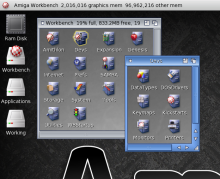
FourOne Theme for Afa
Submitted by klesterjr on 12 May, 2013.
I painted this because the older Afa themes look so small on higher res monitors. While it incorporates updated visual cues, its primary attribute is that it is much larger (will likely look awful on small monitors).
Attachment
fourone.lha48 KB

